Introduction
In the sector of web design and development, the technology is growing very fast. Many new devices have come to an existence such as laptops, mobile phones, tablets etc. and the requirement of users have changed accordingly. With the growing needs, every client wants a mobile version of their websites, but meeting their requirements practically is impossible. As it is very difficult to create different designs for each and every device like Blackberry, Android, iPhone, iPad, Windows, Netbook, Kindle etc. and all of them must be compatible too. So to overcome these constraints, we should shift our design thinking and the solution is here, Responsive Web design (RWD), it is about a whole new way of thinking about design.
Definition of Responsive Web Design
"Responsive web design is a web designing technique that allows the normal web pages to be viewed on wide range of devices having different screen resolution and orientation. This approach provides optimal usability, accessibility, readability and rich user experience."
What is Responsive Web Design?
Responsive web design is the approach that proposes, the design and development should respond to the need of its users and allowing desktop pages to be viewed in response to the size of the devices screen one is viewing with. Responsive web design is a combination of flexible layouts and grids, images and CSS media queries with an extension of @media rule. A website using RWD adapts quickly to each and every device as the user switches from laptop to iPad or iPhone or to any device, the website automatically adjusts to his/her preferences.
Concept of Responsive Web Design
The term responsive web design was introduced by Ethan Marcotte for "A List Apart" in a May 2010. It actually originated from the idea of responsive architectural design, where a room or a space automatically adjusts to the number and flow of people in it.
"Recently, an emergent discipline called "responsive architecture" has begun asking how physical spaces can respond to the presence of people passing through them. Through a combination of embedded robotics and tensile materials, architects are experimenting with art installations and wall structures that bend, flex, and expand as crowds approach them. Motion sensors can be paired with climate control systems to adjust a room’s temperature and ambient lighting as it fills with people. Companies have already produced "smart glass technology" that can automatically become opaque when a room's occupants reach a certain density threshold, giving them an additional layer of privacy."
Main Features of Responsive Web Design
- Flexible grids and layouts means page element sizing to be in relative units like percentage, pixels or points.
- Media queries help us to target device classes and also to check the device physical characteristics.
- Using flexible images means images are also sized in relative units, so that it should not render outside their containing element.
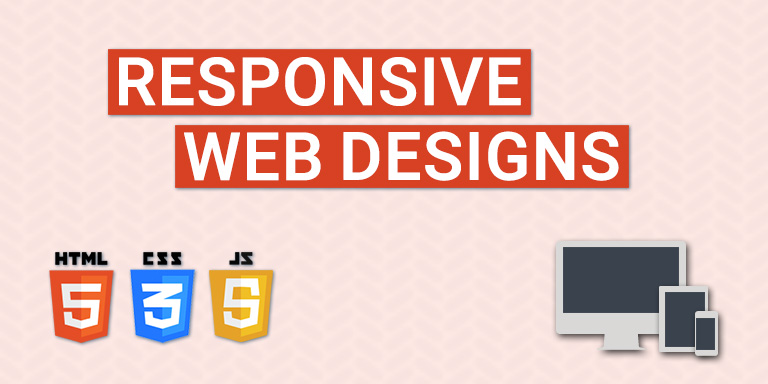
RWD allows us to create a site that works across variety of devices without creating separate mobile sites. All we need is a basic knowledge of HTML5 and CSS3.
Why is Responsive Web Design Important?
Here are the reasons why you should add RWD to your website.
- User friendly website: Responsive web design makes your website user friendly. Users or visitors of your site can use it on any device of any screen resolution and provides them very smooth and optimized experience.
- Adjusting screen resolution: Best feature of RWD is that it can easily adjust to any screen size resolution, whether you are using desktop, iPad or iPhone or any other device. There are number of devices come with varying screen resolutions and obviously we cannot create custom design for each one.
- High ranks in Google (SEO): SEO is very time consuming process and you have to focus how to increase your search engine page ranking. But if your site is responsive, you can easily manage your website with a single hypertext link and can save your valuable time and can improve your search engine ranking and page positioning too.
- Less cost and time for maintaining sites: If you are using responsive web design for your website (If your single site fulfills the needs of all devices using single set of code and pages as compared to maintaining two sites at the same time), then it will be cost effective and can increase your profits.
- Target mobile segment: Today, if you check your analytics, you will find that most of the traffic of your site visitors is coming from mobile devices. So, to pull more traffic for your site you should use responsive web design because it targets more of mobile users.
- Enhance user's offline browsing experience: HTML5 sites allows its users to browse even offline in the absence of internet connection. If the user wants to read the content of your website and if your site is responsive, then it allows to access the data "on the go".
Conclusion
A responsive website design is must for all type of websites carrying out any kind of business, because responsive design can help you to pull more traffic, earn profits and cost cutting. With the increased competition, it becomes very necessary for all organizations and companies to stay updated with the latest technologies and development.